Milwaukee Journal Sentinel

Windows bring daylight to center of ranch

Steve Klein, owner of Klein Lighting, and Jane Klein, owner of Jane Klein Interiors, brought elements of their individual expertise to the renovation of their Fox Point home.

Steve Klein, owner of Klein Lighting, and Jane Klein, owner of Jane Klein Interiors, brought elements of their individual expertise to the renovation of their Fox Point home.

When an interior designer and a lighting designer join forces, the results are likely to shine — especially if the work is done in their own home.

And that was the case after Steve and Jane Klein bought a flat-roofed ranch-style home with no basement in 1992, then added both structural and accent elements that they loved. She is the owner of Jane Klein Interiors and does residential design; he is the owner of Klein Lighting and does residential and commercial lighting. Both work out of their Fox Point home.

The couple said that when they bought the three-bedroom, 21/2-bath house that was built in 1952, it had been languishing on the market for a year and wasn't in prime condition. But that wasn't a concern as they knew that any house they bought would be totally redone to suit their styles. And the home did have one big plus. It was located on a 11/4-acre lot surrounded by natural areas and backed by a deep ravine.

Despite lots of ideas, the couple weren't able to dig into a renovation immediately because soon after they moved in, water began pouring into their home though their roof.

"We knew the roof was bad, just not that bad....We bought it as is," said Steve.

Eventually though, they were able to start making changes.

The first rooms they addressed in their 3,000-square-foot home were the bathroom for their children, (Henry, 31, who lives in South Milwaukee, and Sally, 28, who lives in Milwaukee), and their master bathroom.

"The kids' bath previously had sea green and yellow tile with a Crane sink and a molded faucet that had problems. The room doesn't have a window, so we wanted to keep it light. I wanted it white with colorful accents and a stone floor to be like the rocks at a waterfall we visited at the time.

"I found 1-inch-square glass tiles that came in about 100 colors and patterns, so I bought all the variations for the walls and countertop. Then the tile installer told me I would need at least 400 1-inch pieces to fit — in addition to large white tiles we were using between them to create a pattern. So I had to find more things to mix in and it really turned out better with Legos, seashells and bottle caps," said Jane.

The master bath, which was also dated, was updated with a countertop made of a serpentine stone, and the same stone was used in tile form on the floor and around the tub deck.

"I saw it while I was working on a client's kitchen and I loved its watery look," Jane said. "I tiled the shower with clear glass tile with a molded daisy border, and we added wall sconces made of Murano glass.

"All of our bathrooms have wall sconces because the best light for seeing yourself in the mirror is to have light coming from each side," she said, adding that Steve also added a fixture made of staggered Capiz shells to diffuse the light.

Other work was done throughout the house, and by 2007 they were able to add their dream kitchen. But to do that, they had to remove nearly the entire front of their house, so they enlisted the help of a good friend, Mike Garniss, who is the owner of Tiffin Millwork, Milwaukee.

In the renovation they bumped out an area near the center of their house, where their former kitchen was, and added a circle that is 17-feet in diameter. They also made improvements at the front of the house on either side of the kitchen.

Today, their kitchen is the focal point of their home with unique elements at every turn.

In the circular area there are small windows around the top, large windows across the front, a round ceiling over a large amoeba-shaped island that Jane designed, and plenty of unusual lighting.

Jane said she decided on creating a circular area in their kitchen "because we already had some curved walls in the house and the circle was much more interesting and brought daylight into the middle of the house."

That amoeba-shaped island — made from a single piece of Verde Tahiti granite — was selected for its curves, too.

"The curves make it more comfortable to sit around than islands with straight lines and hard corners," she said. "The shape also complements the flow of green and inky black areas in the slab. The same stone, but with a striped pattern, was used for the perimeter counters, and we used smoked glass as a backsplash."

The couple picked random bluestone flooring in the new space and put an in-floor heating system under it; doing the work themselves, as they wanted the pieces of stone to be artistically placed.

When it came to lighting, one of the unique pieces is their chandelier, which is called Zettyl Z and was designed by German artist Ingo Maurer. Steve describes it as two lamps with stainless steel rods and paper clips and said the light originally came with pieces of paper that had sayings on them in different languages that could be hung on the rods. When buying this piece, the object was for the homeowners to use it as is or to add their own artwork to personalize it.

"It forms a luminous shape," he said. "We put stuff up there that we treasure. Jane and Sally did the snowflakes on the top."

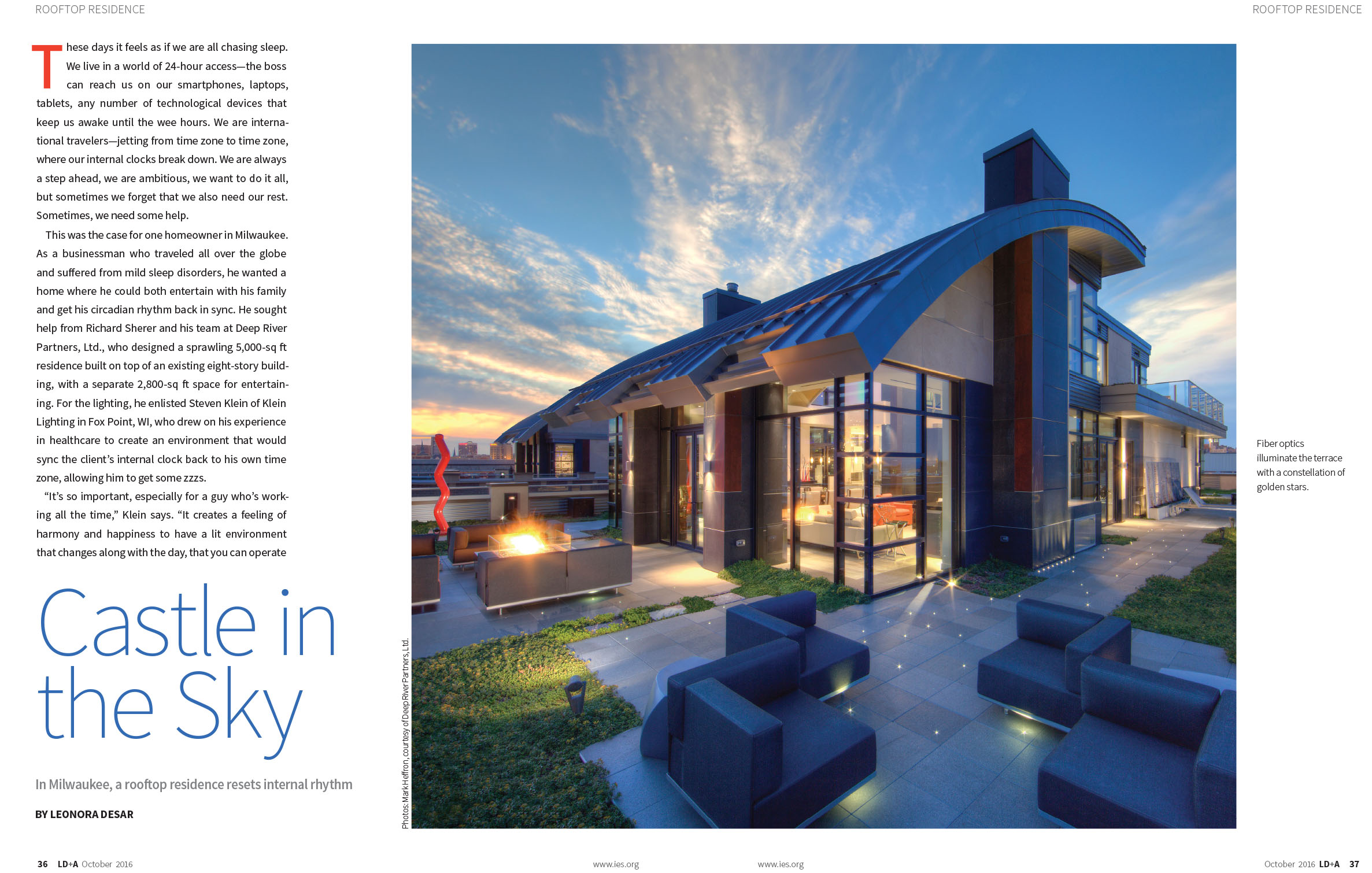
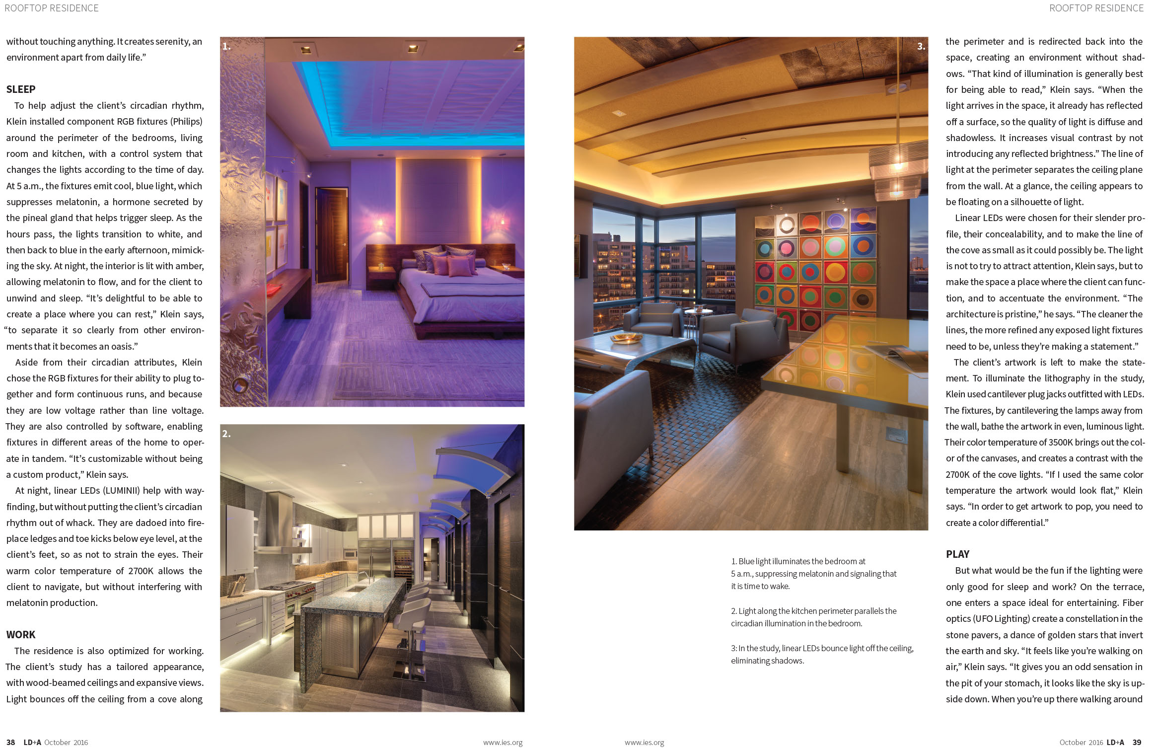
In addition to the chandelier, Jane said her husband created "a color-changing starry ceiling dome with end-emitting fiber optic strands and added turquoise glowing light tape around the ceiling's perimeter, recessed adjustable lights that light bookcases, art and island surfaces, three wall sconces that can brightly light the entire space, and under-cabinet strip lighting.

"All of the lighting dims, so the light can be just what's needed for whatever is going on," she added. "Steve lights it all up, and that makes all the difference in how the room both looks and functions," she said.

The Kleins recently talked about their home and how striking it looks at night due to the lighting. Steve also noted that he did the lighting at this year's Breast Cancer Showhouse in Oconomowoc, when the home was recently renovated.

Q. Why did you choose this look in your kitchen?

Jane: To me, natural materials like stone and wood have a relaxed and authentic feel, and I wanted that to ground the space as a base for everything else that would come and go.

The floor is a big mosaic art project.... Mosaics are a very old art form, and random stone, while used often in midcentury modern homes, also has an old mysterious feeling. The deep blue gray color has a murky quality, and the stone on the countertop has that feeling as well, along with the mossy greens that are appropriate because we live in the woods and there's lots of moss. It's a quiet background for brighter, fresh colors like the stove, red accents and art. It all balances.

Q. What color is your stove?

Jane: Vermillion. Our other appliances are stainless steel, and the cabinets are natural cherry and were custom made.

Q. How did you change the areas on either side of the kitchen?

Jane: On one side we made the entryway larger and added two closets. We also reconfigured the hallway so it blocks the view of the bedroom and bathroom from the front door. On the other side we reconfigured the space. It now has a laundry room, powder room, kitchen cabinets and an office area.

Q. In addition to the kitchen chandelier, do you have another favorite lighting piece?

Steve: The Artemide chandelier over the dining room table. It has all the attributes of a crystal chandelier in the simplest possible form. It provides indirect up lighting though the crystals onto the ceiling and it creates a pattern on the ceiling.

Q. What is your style of decorating?

Jane: Classic, modern and bohemian and inspired by our travels. The colors I use have to have a happy, exuberant feel about them.

Q. What are some of the other amenities in your home?

Jane: We have nearly floor-to-ceiling windows in the living and dining rooms, which are an open concept. We also have a very large fireplace ...The house has a circular pattern and the fireplace is in the middle.

Do you, or does someone you know, have a cool, funky or exquisite living space that you'd like to see featured in At Home? Contact Fresh home and garden editor Nancy Stohs at (414) 224-2382 or email nstohs@journalsentinel.com.
Source: http://archive.jsonline.com/features/home/curved-walls-inspire-addition-of-circular-kitchen-b99719634z1-379852801.html

Let There Be Lights


Illuminating solutions for your home and yard

September 07, 2012|By Kari Richardson | Special to the Tribune

im Tacheny installs exterior lighting for a living, but at the end of a long day, he still smiles when he drives up to his house and sees everything lit up.

"Lighting is enjoyable for the long haul," said Tacheny, principal of Estate Lighting Inc., based in Richmond, Ill. "We spend a lot of time in darkness in this part of the country. Lighting helps."

Artificial light is a subtle, but important component of your home's atmosphere: Get it right and people may not even notice. Get it wrong, and they are likely to feel uncomfortable or, worse yet, be unable to perform basic tasks well.

"If the light quality is poor, I can walk into a space and look at people's faces and figure out what's going on," said Milwaukee-area lighting designer Steven Klein. "They will be squinting or blinking. They might be squirming around and trying to readjust their bodies. That's not the way it should work. Light should be supportive of functions."

Gone are the days when a new home's lighting consisted of dining room and foyer chandeliers and a smattering of outlets designed to plug in lamps. Today's homes include chandeliers and lamps, as well as sconces, recessed lighting, under-cabinet lighting and up lighting on crown molding, to name a few.

With more choices than ever, it can be difficult to get it right. Here are some tips to help your home shine:

Develop a lighting plan. Most architects and lighting specialists query clients about hobbies and habits before beginning the design process. Don't rush your responses. Take the necessary time to think through the likely uses for each of your home's areas and to get feedback from family members before starting to build or remodel. Adding fixtures and outlets costs more once construction is complete.

Are you an avid reader who wants to loll on the couch in the living room while paging through novels? Do you need specialized light in the kitchen to chop peppers for your favorite stew?

"People think table lamps are great if you like to read in bed," Klein said. "But table lamps cast a lot of light and that's not always great if the person who is lying next to you wants to sleep." A better solution, Klein said, might be a wall-mounted sconce that shines a beam of light directly onto the reader while her partner soundly snoozes. Solutions appear when you identify needs ahead of time.

Clients of Tandem Architecture and Construction in Lincoln Park plan for their lighting needs before construction begins. A final walk-through, though, allows homeowners to add last minute electrical outlets or fixtures before dry walling begins, said Chris Walsh, the firm's principal architect.

Multiple kinds of light. "Lighting has become another way for someone to customize their home," said Brian Brunhofer, president of Meritus Homes. Customers no longer make do with standard builder-grade fixtures. Lighting packages include recessed lighting, as well as fixtures for the kitchen, dining room and hallways. Opportunities abound for clients to add their stamp to a home's lighting.

Klein gives the example of the kitchen, one of the most-used rooms in the house. Ambient lighting from recessed fixtures or a fluorescent light might provide a backdrop. Task lighting allows the chef to perform functions requiring hand-eye coordination, such as cutting, chopping and stirring.

At Richelieu Flats, a boutique condo building on Michigan Avenue with four full-floor residences and a duplex penthouse, the lighting mix includes ceiling lamps, accent lighting, sconces and recessed lighting. Careful attention was paid to lighting in common areas, including the lobby and garage, to make sure residents and their guests felt safe and welcome, said Millie Rosenbloom, listing broker for the property.

"We wanted people to feel like they had enough light when they got out of their cars and that no one's parking space was shortchanged," she said.

Accent lighting. Use lighting to play up key architectural features or prized possessions. Highland Park-based lighting designer Mitchell Kohn worked hand-in-hand with an architect to create specialized lighting to accent a home with "origami ceilings," multiple ceiling angles within the same room. His design included a 3-inch gap between the upper wall and ceiling, where light was installed to accent the unusual design.

Though most homes don't have such a dramatic detail, lighting can draw attention to more subtle architectural features, as well. Also to consider: prized possessions, such as artwork or collections that might be worth highlighting.

"Accent lighting brings attention to things people treasure," Klein said. "It's a reflection of their values."

Lighting in layers.Instead of viewing your home's lighting as an on/off switch with two options, blazing bright or jet black, work to give each room layers of light that can be added to or subtracted from as needed. The first layer is natural light, said Brandon Weiss, president of Weiss Building & Development in South Elgin.

Weiss also includes light coves in many of his homes, indirect lighting built into recesses in a ceiling or high on the walls of a room. Often, this light is all that's needed to brighten a space, he said.

Similarly, properly placed ceiling fixtures and task lighting can prevent homeowners from "turning on a room full of cans," he said.

In Kohn's view, dimmer switches are key to the layering effect. "You should be able to control the intensity of every light," he said. His grown children have installed dimmer switches in every room of every apartment they've occupied over the years.

Don't forget the exterior. Many homeowners limit their exterior lighting efforts to a couple of sconces on the garage to deter burglars. While safety is an important consideration, outdoor lighting can also help highlight a home's beauty at night or when natural light is low.

Good exterior lighting follows many of the same principles as good landscaping, Tacheny said. A key is to use both to draw attention to a focal point, often the front door.

When appropriate, hide the source. Tacheny said a common mistake outdoors is overlighting driveways and pathways, creating a landing strip effect. Instead, he climbs ladders to tuck lights into tree branches and digs into the dirt to disguise them in flower beds.

The same principle holds true inside the house: While a crystal chandelier, prized lamp or mosaic pendant lights may be pretty, not every light source is worthy of notice.

Consider color temperature. Take a secret from the pros, who know that light has different color temperatures, measured by a unit called a Kelvin (K). If, like most people, you prefer warm, yellowish light, look for bulbs rated 3,000K or lower. If it's blue light you crave, select bulbs rated 4,000K, Kohn said.

In the right light, furniture, accessories and artwork look their best.

"When someone walks into a room with poor lighting they might say, 'Gee that's an ugly couch.' They probably won't say, 'Gee, the lighting's ugly in here,'" Kohn said.

Cottage Redefined

LAKE MICHIGAN VACATION HOME, A GATHERING PLACE FOR FAMILY

 Architects: Deep River Partners, Milwaukee                                                                                   Builders: RP Custom Homes, Mequon                                                                                          Interior Design: Susan Sherer, Trace Burger, Deep River Partners

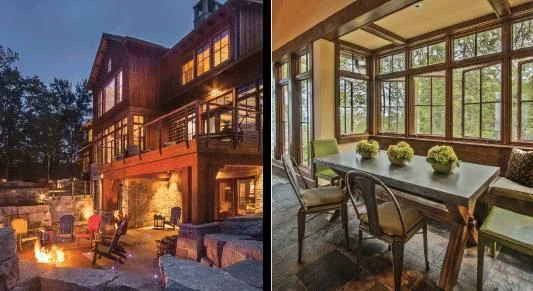
Outdoor living is at its best from the raised terrace that includes an outdoor kitchen, dining area, fire table and hot tube -- and magnificent lake views. 

Outdoor living is at its best from the raised terrace that includes an outdoor kitchen, dining area, fire table and hot tube -- and magnificent lake views. 

(Left) Steps from the front entry draw visitors to the lower level atrium and the stunning "river" that flows the length of the house to the lake side of the property. A boulder that washed up out of Lake Michigan was carved out to create a fountain…

(Left) Steps from the front entry draw visitors to the lower level atrium and the stunning "river" that flows the length of the house to the lake side of the property. A boulder that washed up out of Lake Michigan was carved out to create a fountain. 

(Right) Dramatic architecture through the main corridor of the house framesviews of Lake Michigan. It is the first view for visitors to the home designed by Deep River Partners architects. "The entry brings users from the wooded west side of the property to the lake," says associate designer Nick Blavat. Sounds of trickling water from the lower level atrium draw visitors downstairs where they find a meandering water feature that stretches the length of the house to a beachside exit.

Written By: Janet Raasch                                                                                                                       Photos By: De Maio Photography

A photograph of Pat and Louise’s cottage on the shores of Lake Michigan just north of Milwaukee hangs on the wall of their master bedroom. The beloved cottage gave way to this new vacation home for the Hinsdale, Ill., family — an impressive 10,000-square-foot house designed by Deep River Partners architects that redefines the concept of a lake cottage. Its modern rustic style is North Woods Wisconsin meets Colorado ski lodge.

Even though the structure has changed, the spirit of the original house is intact. “I was worried when we built the new house it would separate me from the things that center me,” Louise says. “But the same reasons we love being up here are the same as in the old house,” she says. “It’s the surroundings.” Their growing family — seven children ranging in age from 17 to 33, spouses and several grandchildren — necessitated a larger house. “We built a space to accommodate our activities,” Louise says. “We wanted our grown kids to want to come back and spend time with us.”

Architect Richard Sherer, who spent his boyhood summers along the same stretch of Lake Michigan, says the lake was a driving force in the design. “The lake becomes the paramount feature of the property and is ever changing from one day to the next,” Sherer says. “The vista of the lake is of utmost importance; I took that seriously when designing the home.”

The design concept also was driven by the needs of such a large group while balancing intimacy and privacy, Sherer says. “It’s also creating a home that’s comfortable and casual in nature where its users can feel at home and comfortable, even in a wet swimming suit,” he says.


The 33-room house is divided by a three-story atrium that on the main floor separates what Sherer calls public and private spaces. Two floating glass bridges connect the bedrooms — including two full master suites and a loft — to the great room, kitchen, dining room, sitting room and private office for Pat, a commodities trader, to work remotely.

The lower level features a dramatic water feature that flows the length of the house from the wooded areas outside the main entry to the beach and water on the east side. Two bedrooms with bathrooms, a living room, exercise room, game room, home theater and a full spa-like bath with changing rooms and lockers for guests to change into beach attire are also on the lower level.

Architectural designer Nick Blavat says the eastern influenced architecture brings a subtle theme of sojourn to the residence, which is carried through in the interior design by Deep River Partners’ Susan Sherer and Trace Burger. The finishes throughout the house, such as African slate flooring, are meant to withstand the rigors of beach living and lots of traffic. Stained birch that gives the appearance of walnut is used throughout the residence and for the kitchen cabinets. “The finishes in the house are beautiful but not so fancy that you can’t really use the place,” Louise says.

Initially, the couple were considering keeping the cottage and building a guest house on another part of the property, but Louise didn’t want to lose the connection to the lake. “There is something centering seeing that vast expanse of water. I find that very spiritual,” Louise says. “It gets me out of myself and my everyday concerns.”

Pat and Louise have hosted many family gatherings since the house was completed in May 2011, including 23 people and nine dogs last Christmas. One of her children asked Louise which house felt more like home, the one in Hinsdale where they raised their children or the lake home. “I said, ‘I can’t believe I’m going to say it: This feels like home. This is the place we are going to gather.’

“We live a different life up there,” Louise says, noting that’s true for both her and Pat. “I started a garden last year and quadrupled it this year. I started baking again and am cooking more.”

Pat loves to get on the tractor at the beach. “He doesn’t do any of that at home but he loves to do that sort of thing up here. He loves little projects; for him that is a real escape from always thinking about his work.”

The lake is where the couple plan to retire; accessibility and even an elevator were incorporated into the design. “We did build it for our old age,” Louise says. “I have a mother with Alzheimer’s and my experience is she can still appreciate beauty. I’ve told all of my kids to make sure I’m sitting by a window because I can appreciate that.”

(Top Left) Built-in window seats offer additional seating in the great room and panoramic views of Lake Michigan(Bottom Left) The restful sounds and ever-changing views of Lake Michigan are part of master suite experience. The fireplace mantel and s…

(Top Left) Built-in window seats offer additional seating in the great room and panoramic views of Lake Michigan

(Bottom Left) The restful sounds and ever-changing views of Lake Michigan are part of master suite experience. The fireplace mantel and surround are made from Waukesha white stone. The painting is by Peter Kudlata, owner of Flagstone Landscaping. 

(Top Right) A 14-foot long custom live edge dining table and bench made from a black walnut slab accommodate large family gatherings, which can often number 20-plus people. The chandelier becomes a conversation piece as it holds notes from guests about their experience at the lake. Deep River Partners' principal Susan Sherer assisted with the interior design prior to retiring; Trace Burger came on board to finish the project.

(Bottom Right) The professionally outfitted kitchen is designed to allow lots of people to participate in the cooking process. The vaulted ceiling with windows floods the room with natural light. Steven Klein of Klein Lighting designed the lighting plan for the home, which includes task lighiting around the perimeter of the kitchen. 

The homeowners took great care to preserve the large oak tree on the property in the design and construction of a new lake house. Limestone retaining walls, cedar siding, a metal rood and Chilton stone veneer blend modern and rustic elements in the …

The homeowners took great care to preserve the large oak tree on the property in the design and construction of a new lake house. Limestone retaining walls, cedar siding, a metal rood and Chilton stone veneer blend modern and rustic elements in the design.

(Left) A lower level terrace is designed for a younger family members to sit around the fire put while being in the proximity of the rest of the group. The porch above connects to the master bedroom suite. Fond du Lac stone is used extensively in th…

(Left) A lower level terrace is designed for a younger family members to sit around the fire put while being in the proximity of the rest of the group. The porch above connects to the master bedroom suite. Fond du Lac stone is used extensively in the landscaping.

(Right) The sitting room includes a banquette area. The room was originally designed as a screen porch, but the homeowners wanted it to be enclosed for year round enjoyment. 

Make Believe Daylight

In the first part of this eight page survey on lighting for healthcare, US-style, Lighting Journal reports on some unconventional and inventive lighting design projects at the University of Wisconsin Hospitals and Clinics in the USA. 

With no windows in sight, an innovative lighting scheme at the University of Wisconsin Hospital and Clinics, Madison, Wisconsin, USA, has managed to evoke clouds and daylight. Hospital personnel work long hours under high-stress conditions, but if that weren't enough, they are usually deprived of zeitgebers (time givers) -- the main external factors such as temperature, physical activity, ambient noise and daylight patterns that help synchronize a person's circadian rhythms over a 24-hour period. As we know, the most important of these is daylight, the principal stimulus for regulating the body clock. 

Staff and patients at the hospital now receive a healthy dose of this zeitgeber, as a result of a lighting design project executed by Steven L Klein, of consultants, Klein Lighting. The 200,000 sq m facility is entirely indorrs and offers very little access to daylight. The project was part of the renovation of the hospital's Department of Emergency Medicine, for which Klein Lighting provided the design concepts, reflected ceiling plans, construction details, elevations drawings and specification of lighting equipment. 

Not surprisingly, the hospital's philosophy centers on wellness and health, with stress reduction as a key component in the healing process. The lighting design at UWHC was especially challenging because of the scrutiny of health professionals who are typically concerned with evidence based outcomes. There was always a keen sense of 'this better work or else' concerning each design concept, most of which the hospital had not previously conceived of or attempted. 

Faux skylight in offices and treatment rooms five windowless rooms a welcome daylight reference

Faux skylight in offices and treatment rooms five windowless rooms a welcome daylight reference

A new lighting design vocabulary was developed that departed from the institutional designs of the past. First were the daylight references. As a trick of appearance, scores of faux 'skylights' (or miniature luminous ceilings) were specified for the examination and recovery rooms, as well as several office spaces. These appealed to users not only as a supplementary daylight reference, but as a welcoming departure from conventional, institutional-looking lighting equipment. 

Obviously the configuration is artificial and there is no window in the ceiling. The faux 'skylights' are actually deeply recessed coffers with a simulated sky panel diffuser created by a silk screening. One secret to the successful integration of the fixture is the trim that separates the lens from the planer ceiling. By breaking the ceiling plane, the articulation of the fixture is given a metaphoric presence. The blue-sky-and-clouds diffuser makes the figurative appear quite literal -- they look like the real thing for people who need a connection to the outside. Because the application is not actual, but is psychologically appropriate, people easily accept the figurative metaphor of the skylight. This effect has less to do with the amount of light produced than with the quality of light. 

At the same time, the 'skylight' replace conventional lighting equipment and accommodate all the seeing tasks. The specified colour temperature (4100K) and CRI (85), which is 'boosted' by the blue and white of the silk screen sky, is essential for reinforcing this sense of daylight -- as well as being able to accurately render the skin tones of people seeking medical attention, whose can be more easily evaluated when their skin melanin pigments are not enhanced. Warmer lamps of 3000K and 3500K do enhance skin melanin pigments and this colour exaggeration increases the difficulty of conducting an accurate visual triangle. 

The faux skylight system was also extended into the hospital's Cancer Radiotherapy department, where, understandable, the total lighting ambient was designed to be visually uplifting, and calming, in order to comfort patients, family, and friends under extreme duress. The waiting room has a particularly notable lighting scheme which brings nature and quality lighting into the challenging windowless basement level, to create a unique atmosphere with an illusion of daylight. Multiple effects have been realized using a single fiber optic system, powered by a 70W metal halide illuminator. 

The rustic stone walls are emphasized by bringing out the stones' natural beauty and texture, using close-offset down lighting--the same system frames and highlights a series of painting nature scenes by a local artist. Delicate balances of cool and warm interior colours are enhanced using the highest colour rendering lamps -- carefully integrated T5 fluorescent lamps are used  throughout to minimize cove depths and maximize the available ceiling heights.

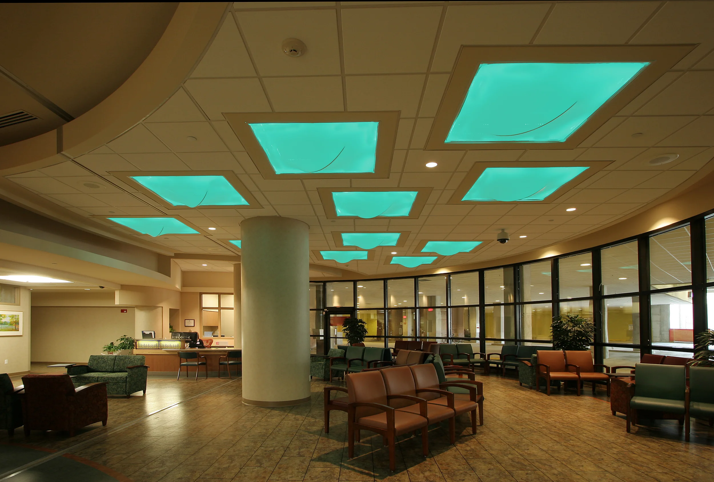
Waiting Under the Clouds                                                                                                                          Innovative lighting techniques were also carried through to the Emergency department waiting room. here the waiting room ceiling has eleven translucent lycra-wrapped 1200x1200nm custom fixtures that act as figurative clouds. Each unit features a twin 39W 4100K compact fluorescent strip, and eight Color Kinetics iColor NXT tubes, with RGB mixing. The fixtures' amorphous shapes pay homage to Kazuhide Takahama's light sculptures and can be visually interpreted as clouds due to their opaque nature and shape. 

The custom-made liminaires express the characteristics of clouds that usually appeal to people -- opacity, form and kinetic movement. The fixtures slowly cycle between the two selected colours -- blue and green -- chosen because they are closest to that part of the spectrum (around 500nm) the human eye is most responsive to. As a result, the pupillary mechanism doesn't adapt to the radiance created and the result is a perception of greater brightness. The supposition behind the design is that in a stressful situation people's emotional can be manipulated by conveying the impression of brightness. The concealed light sources indirectly illuminate the inside of the lightbox, to wash coloured light across the space below and they are equipped with auxiliary compact fluorescent lamps to assist night time cleaning and maintenance tasks. 

The light level is quite subdued most of the time. Direct illumination from 100nm diameter clear open 35W metal halide reflector downlights are limited to specific areas for supplementary tasks like reading. In this subdued luminous environment, the main lighting is capable of minimizing anxiety and offers a subliminal soothing effect. A post occupancy survey conducted by the hospital confirmed that people who have to wait are indeed calmer, demonstrating that the lighting can help to begin the healing process before the patient ever sees a doctor -- an outcome that satisfied our evidence-driven clients. 

For more information contact steve@kleinlighting.com

Credits:                                                                                                                                                       Lighting Designer: Steven L. Klein, IALD, LC                                                                                             Interior Architect/Designer: Ardis Hutchins, AIA, IIDA                                                                               Photography: Joe Demaio Photography